
Bedouin
A B2C insurance desktop web application that provides travel nurses peace of mind
Overview
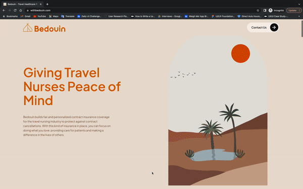
Bedouin is B2C web application that builds fair and personalized contract insurance coverage for the travel nursing industry to protect against contract cancellations.
As a result, they can focus on doing what they love; providing care for patients and making a difference in the lives of others.
Challenges
The clients are excited to launch Bedouin in 2023, but are unhappy with the present website because it lacks functionality, usability, directions, and a cohesive visual theme. Additionally, as they are new in the market, one of their biggest priorities is ensuring that the website looks professional, legitimate, and trustworthy.
Solutions
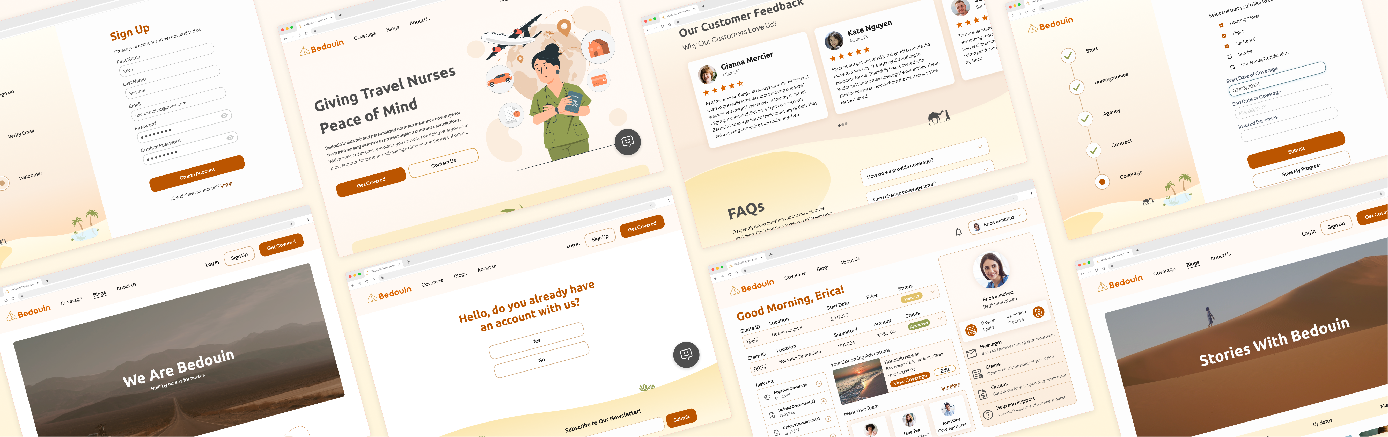
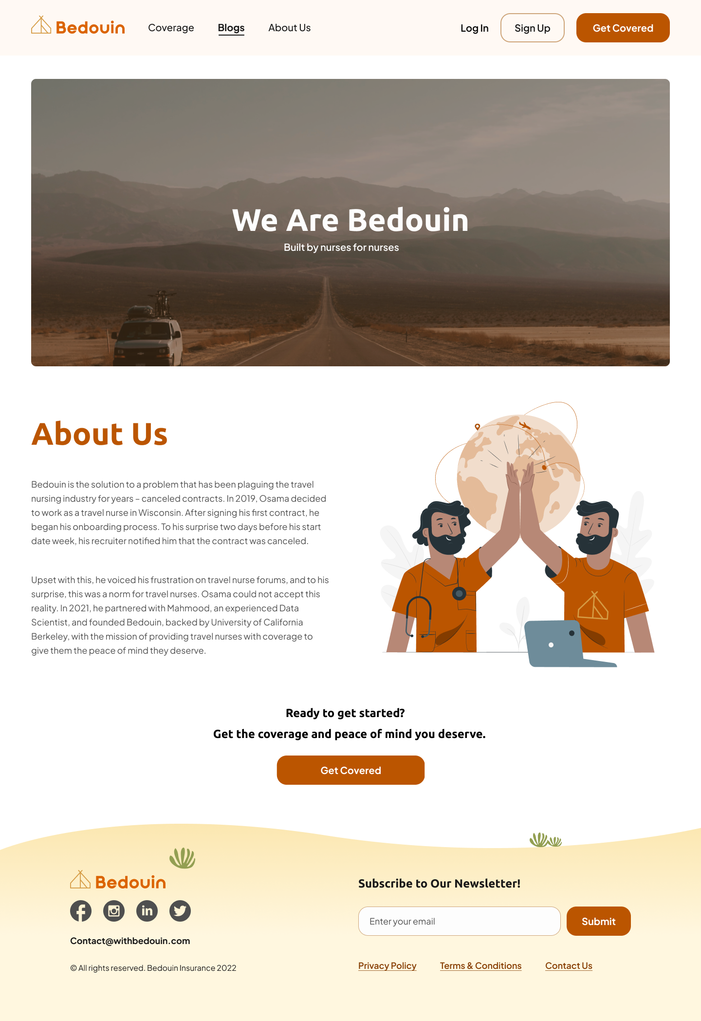
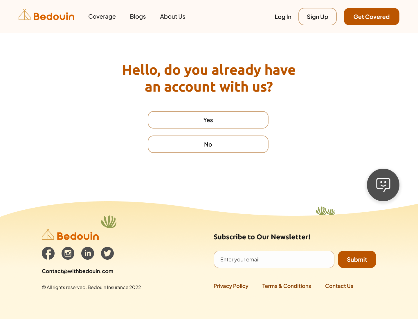
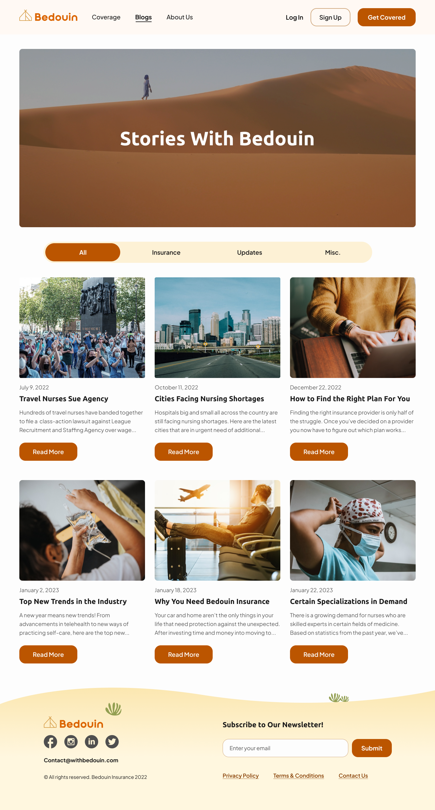
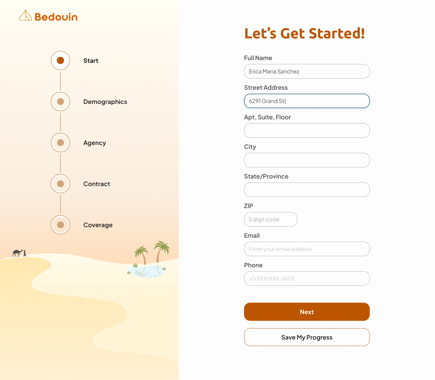
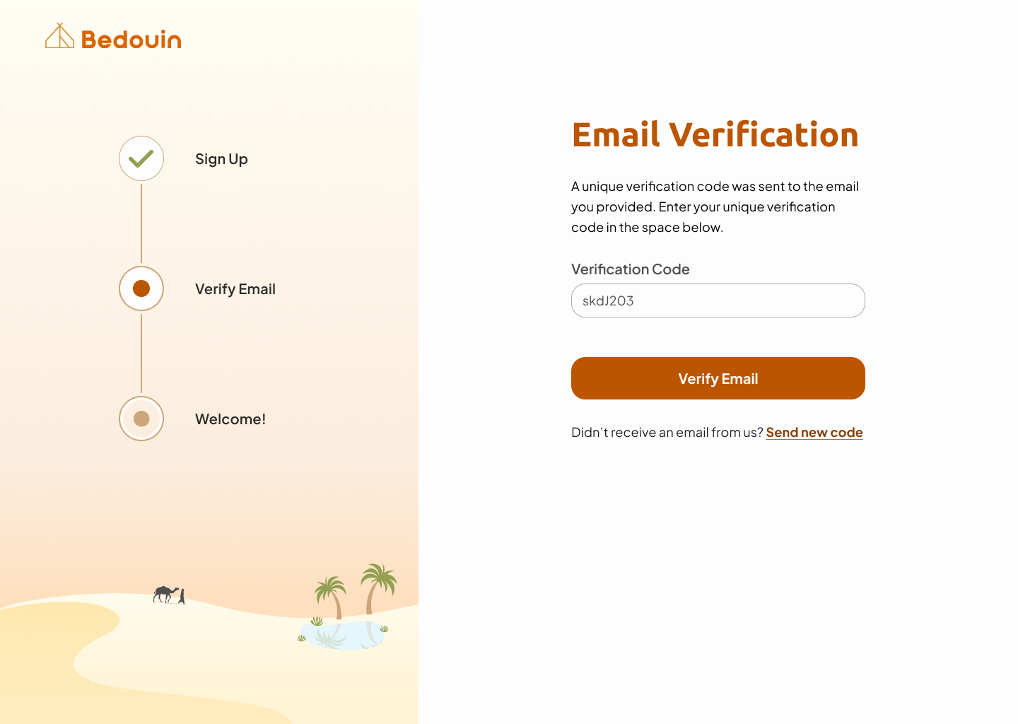
Our team redesigned the home, sign-up process, user profile, and quotes pages to make them more accessible, unified, appealing, and easy to use. Along with those adjustments, we designed new pages – Blogs and About Us – to boost their credibility and build rapport with the customers.
Process
– Project kick-off and Client Questionnaire
– Ideation
– Wireframes
– UI Design (HiFi)
– Style Guide
– Developer Hand-off
Tools
– Zoom
– Adobe Creative Suits
– Slack
Roles
– Brand Designer
My Design Process
1.Discover
1.1 Design Kick-off
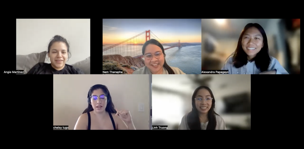
I scheduled a kick-off call with the team where we got to know each other and reviewed project briefs, expectations, client assets, and the project timeline together.
We are from 4 different time zones, so I made sure everyone agreed to communicate daily on Slack to discuss our designs and that we would keep all of our thoughts and contributions posted to ensure that all ideas and inputs are seen, heard, and valued.
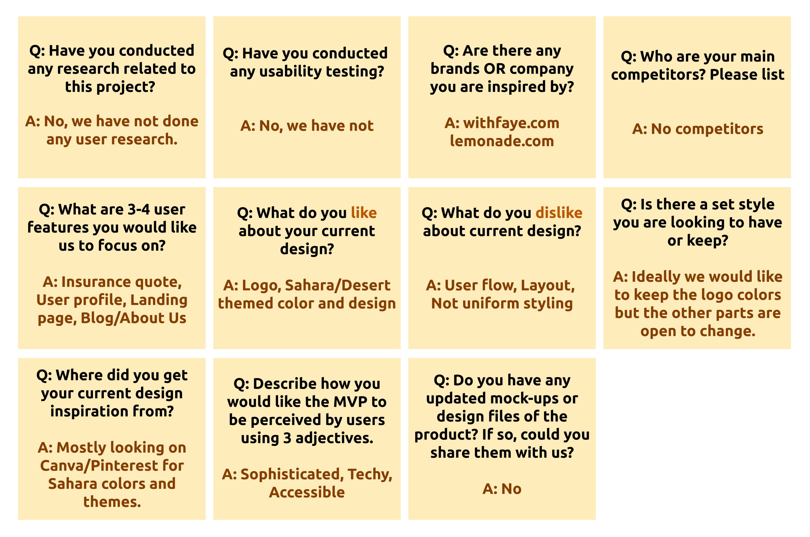
1.2 Client Q&A
I converted a client questionnaire from Airtable to sticky notes to make it easy for everyone to access and review. The client also provided us with information regarding the current requirements of Bedouin and the user stories that they wanted to focus on. The main takeaways were as followed:
Add Blog and About Us pages to develop relationship with customers.
Enhance the user interface, functionality, user flow, and layout consistency.
Build out the quote screens and user profile page.
1.3 Research
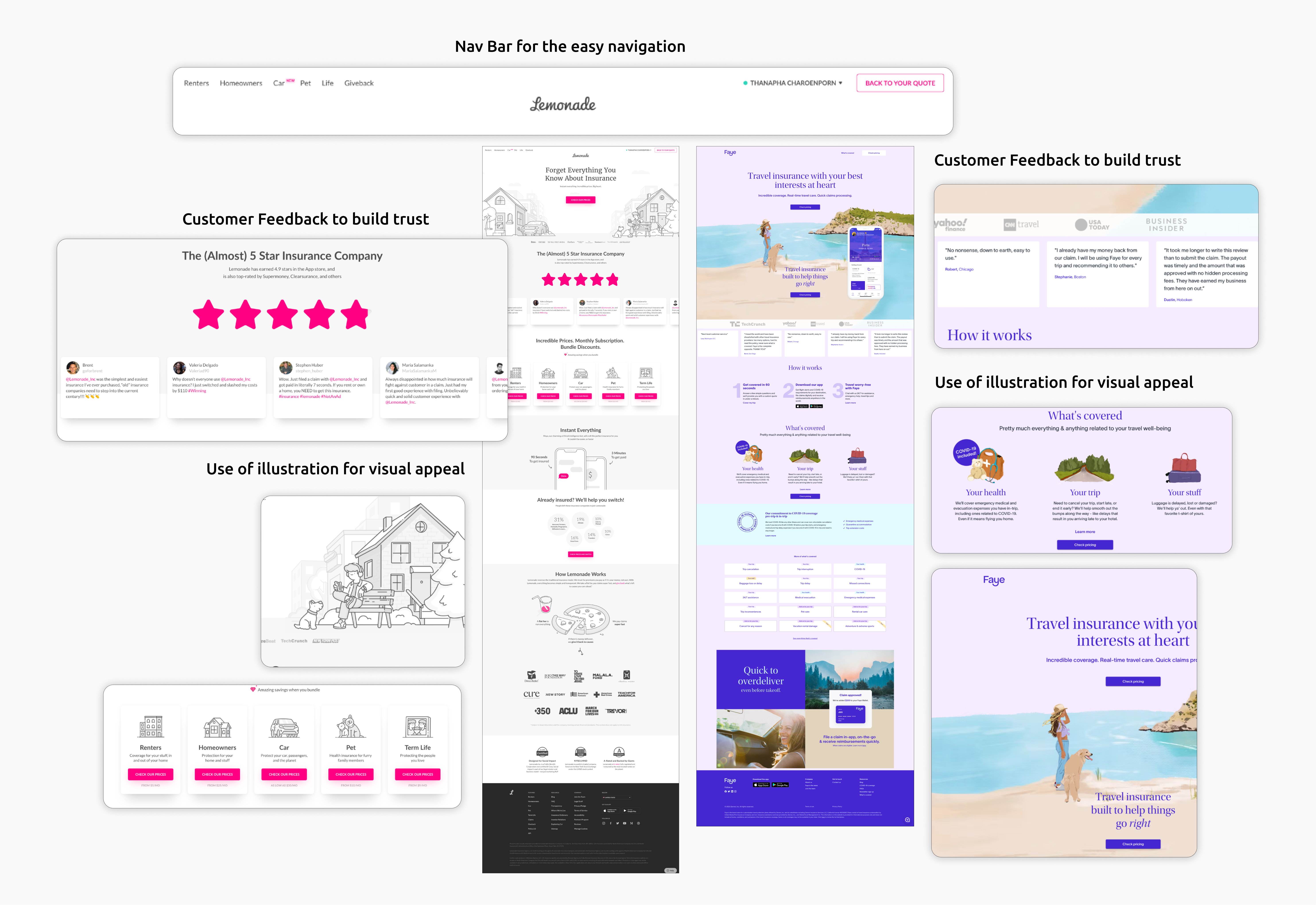
After analyzing the client’s briefs, I explored Bedouin’s present product and researched the inspirations indicated by the client: Lemonade and Withfaye.
I registered on these websites in order to gain a better understanding of the industry. Here’s what I noticed:
- Important CTA is located on navigation bar to draw attention
- Landing Pages have a strong visual appeal with illustrations to creates visual triggers and uniqueness.
- Landing pages display customer feedback to make the website feel authentic by establishing trust and credibility, and overall satisfaction.
- Dashboards are ordered according to the user’s hierarchical importance. (e.g. get new quote, view the quotes, and upcoming events)
1.4 Existing Product Evaluation
After gather the app’s goals and pain points from the client, I played around with Bedouin’s current website. Here is what I observed:
There was no navigation bar, thus it took a long time to scroll and search up where to go.
The spacings are too much, requiring a lot of scrolling, which may not be the best usability.
Accessibility is still lacking. Orange text on a dark background color is difficult to read since it does not meet the standard contrast rate and Web Content Accessibility Guidelines (WCAG).
2.Ideate
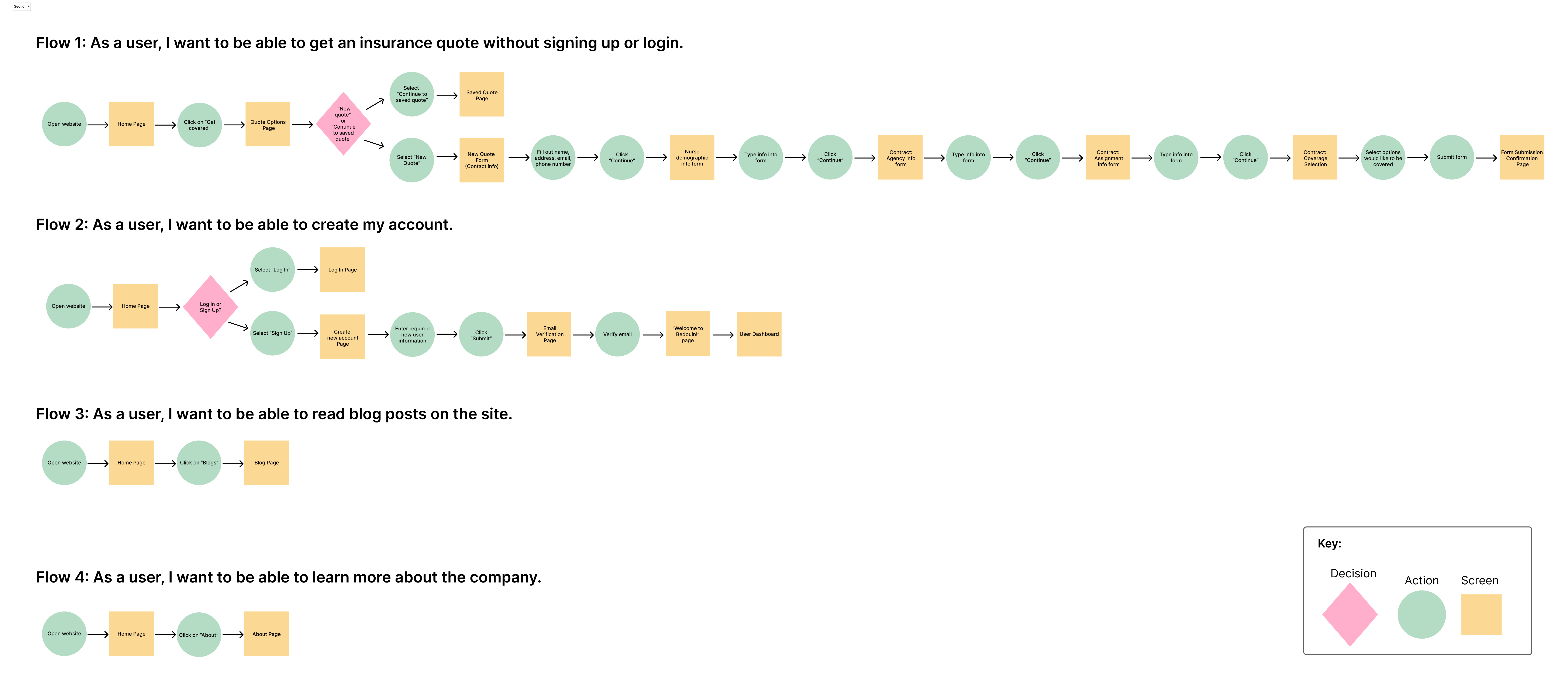
2.1 User Flows & User Stories
The client provided user stories to define the current user journeys that would be the base of this redesign.
As a user, I want to be able to…
- Get an insurance quote without signing up or login so that I can quickly see the quote.
- Create my account so that I can save my quotes and information.
- Read blog posts on the site so that I can see updates about traveling and insurance.
- Learn more about the company so that I build trust and get to know them more.
The team then collaboratively created user flows based on user stories.
2.2 Medium Fidelity Wireframes
Looking at our user flow, I found that the majority of our pages are “Forms”. As the client’s goal is to make the UI consistent, thus my team and I, in Figma, built out the CTA, input fields, and progress indicator into the components to be used repeatedly and easily adjusted in the long run. I also added fonts and colors onto the local styles to make sure that everything will be cohesive.
3.Design
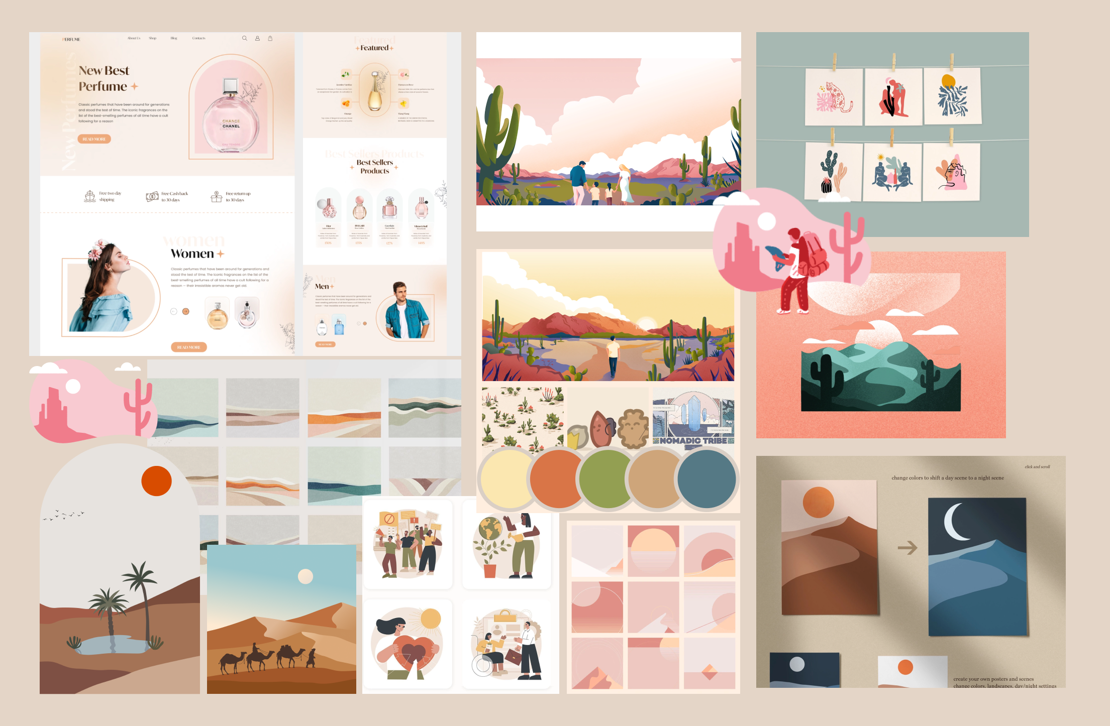
3.1 Mood Board
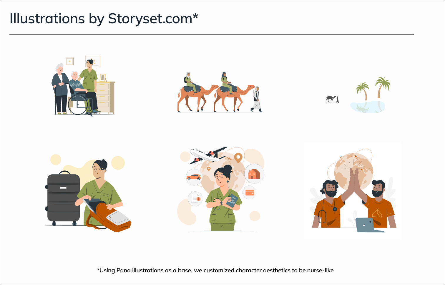
I created a mood board to help illustrate the overall vibe of the website. The UI should be maintaining a visual style that reflects brand personality and theme; semi-nomadic and Sahara Desert.
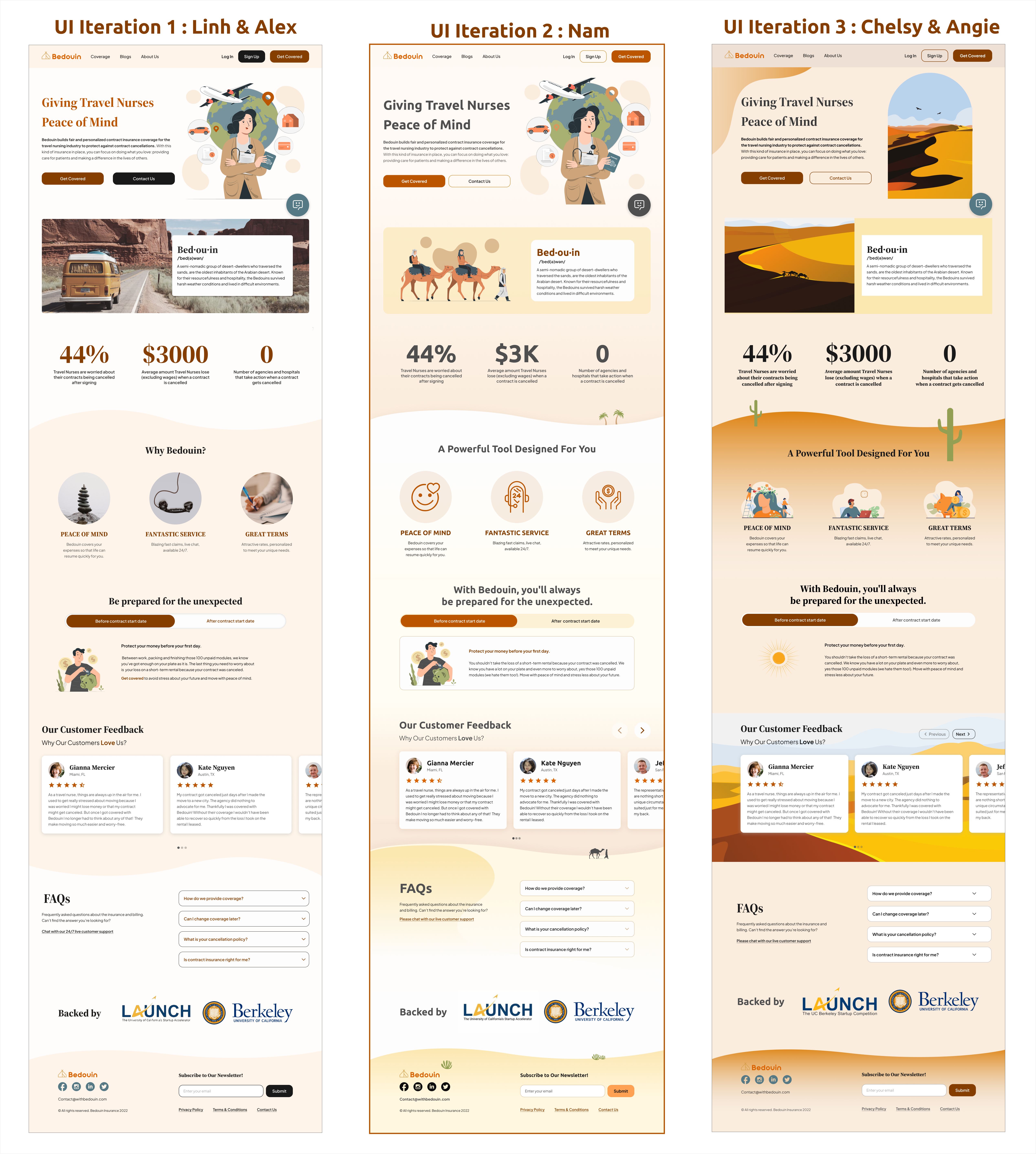
3.2 UI Iterations
We aimed to deliver 3 UI iterations to the clients, so I assigned a pair of team members to each one. We had an odd number of members, therefore I volunteered to work solo. The goal was to have the interface look sophisticated, techie, and accessible in Sahara desert theme.
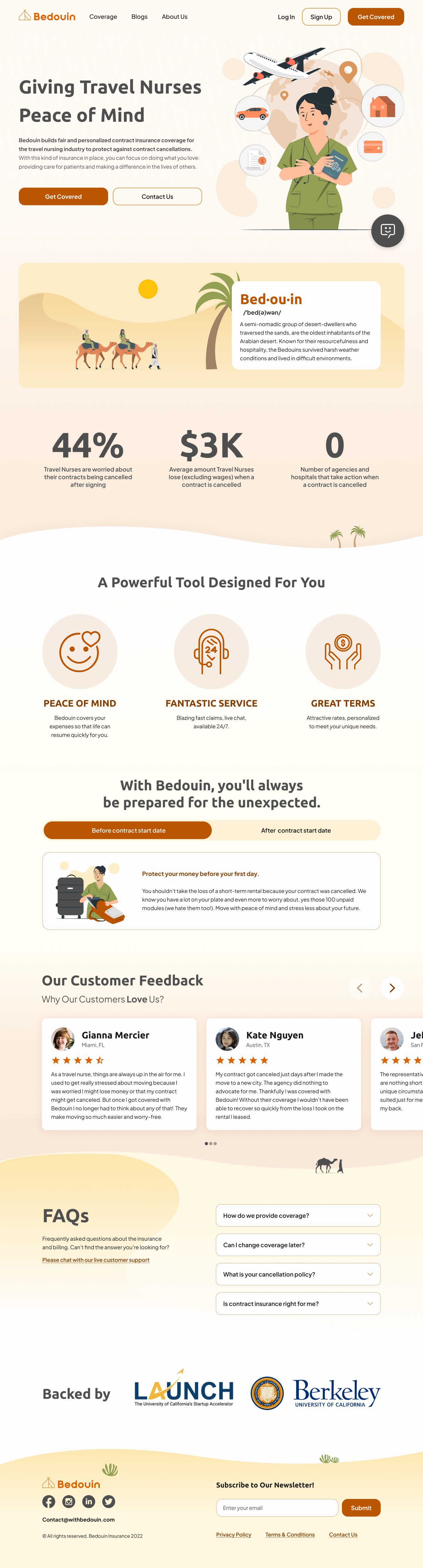
I worked on iteration 2 by using the non-realistic illustrations and choosing light background colors to make the contents stand out more and increase accessibility. I also created the curvy shaped shadows on the section divider to imitate desert sand dunes.
The client chose the iteration 2, which I solely worked on. However, the clients requests some adjustment about illustrations.
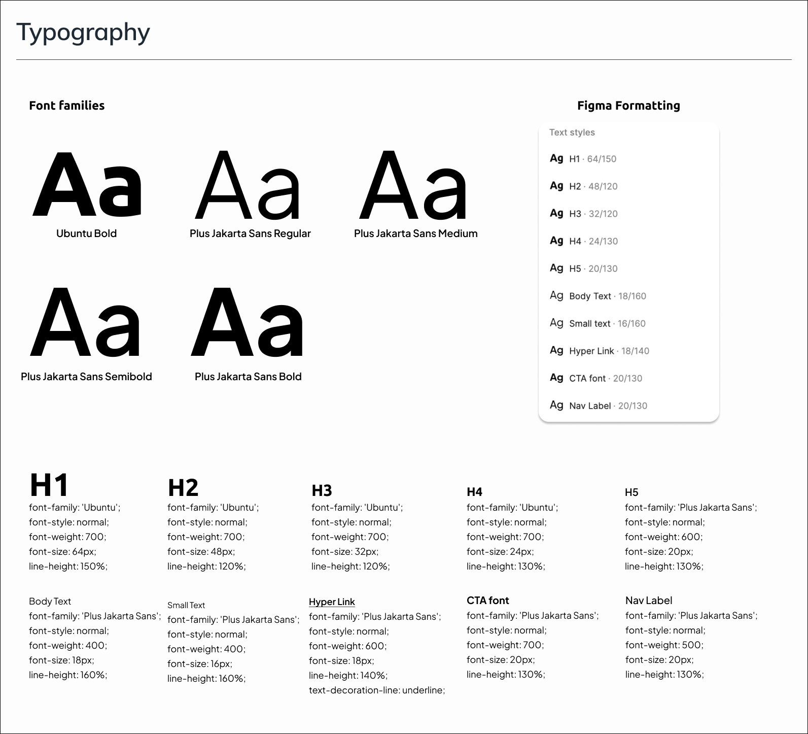
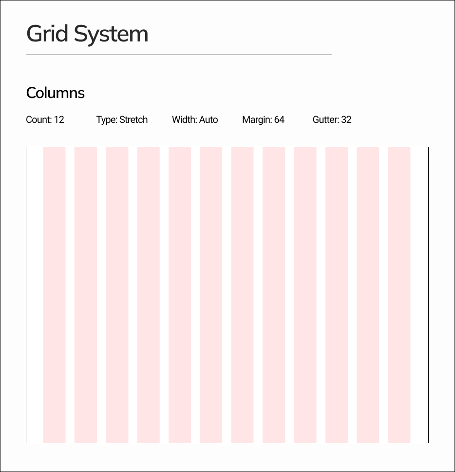
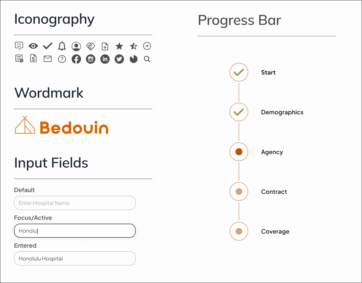
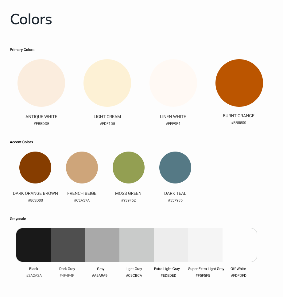
3.3 Style Guide
To maintain consistency across the pages, my team and I built out a style guide including a color palette, UI elements, typography styles, grid system, components, illustrations, and iconography. Using the client’s existing color palette, we developed a similar palette with slight tweaks for improved readability and accessibility.
3.5 High Fidelity Wireframes
After transforming the landing page — the longest and most detailed page — into a HiFi screen, the rest of the pages were simpler to manage. With each team member working on one to three pages each, I worked on the quotes pages. The ready-to-use HiFi component library, on the other hand, is already prepared to keep all the screens uniform. As a result, we were able to complete the high-fidelity screens in a fast, organized, and efficient manner.
4.Developer Hand-off
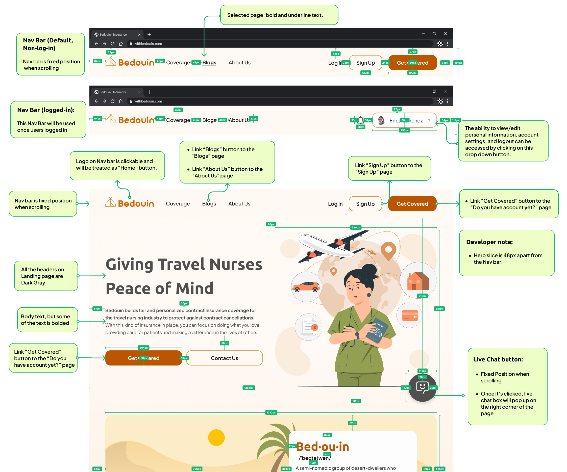
After finalizing the designs with the client, here comes our last deliverable! My team and I prepared the file for developer handoff to avoid confusion and facilitate smooth development. We added annotations for intended functions, CTA routes, spacing measures between items, and additional effects added to the elements.
5.Reflection
Bedouin is an B2C product that will soon be officially launched in 2023. We couldn’t be more proud about it! The team will be watching it closely for future versions and additional features such as invoicing and a dashboard with more information and documentation for the insurance website’s full user experience! Below are my main takeaways.
I brought myself outside my comfort zone
It was an honor and a terrific experience for me to lead this project because it enhanced my communication and management skills, as well as my confidence in my abilities. I enjoyed collaborating with the clients, senior designers, and team members, as well as aiding my colleagues whenever they needed. Further, I cherished everyone’s opinions and ideas, so I always made sure that they were noticed, heard, and appreciated so that we could operate in a respectful and pleasant way.
Communication is key!
How did we complete the project a full week ahead of schedule despite having 4 different timezones? Because we have great communication and teamwork! I made sure that we talked on a daily basis and that the comments/annotations were always left.
Lastly, I learnt how to defend and explain my design ideas in a way that everyone can understand, along with how to be open-minded and respectful of other people’s ideas.
Let’s Create an Experience That Connects!
Your website is the heart of your online presence, and it should reflect your brand while making it easy for visitors to engage. Let’s work together to build a site that looks great, feels intuitive, and helps you grow your business.